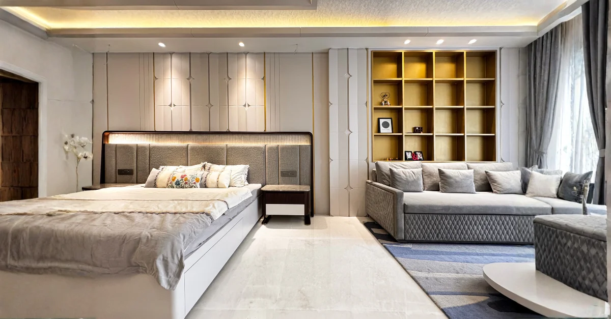
Colour is one of the most powerful yet understated tools in spatial design. It influences how we feel, how we behave, and how we connect with our surroundings. Whether calm, energized, focused, or comforted, our emotional responses are often shaped by the palette that defines a space. For architects and interior designers, colour becomes a language, one that speaks through visual cues, atmosphere, and associations. This nuanced understanding of colour’s emotional impact is central to studios like Rajkumar Architects, whose human-centric design philosophy ensures that every space resonates not only visually but psychologically, creating environments that feel deeply intuitive and meaningful.
At its core, colour psychology explores how different hues evoke distinct emotional responses. Warm tones such as reds, oranges, and yellows tend to stimulate energy and activity. These shades can create a sense of warmth and vitality when used thoughtfully, but if overapplied, they may feel overwhelming. Cooler tones blues, greens, and purples evoke calmness, clarity, and introspection. They help regulate emotional balance and are widely used in bedrooms, wellness zones, and spaces intended for focus or relaxation. By understanding these subtle influences, designers can shape the behavioural patterns associated with each room.
Beyond emotional responses, colour also plays a critical role in establishing a spatial identity. A home’s living room, for instance, might employ earthy neutrals to set a grounded tone, communicating comfort and belonging. A workspace may lean toward monotones with subtle accent colours to ensure mental clarity without visual clutter. Design elements such as trims, furnishings, and textures further enhance how colours are perceived, creating layers of meaning that extend beyond the surface. The identity of a space emerges not from colour alone but from how it harmonises with form, light, and function.
Lighting, both natural and artificial, profoundly alters colour perception. A muted sage green may appear soft and organic in daylight but shift toward grey under warm evening light. Similarly, deep blues can feel serene in a well-lit environment but turn heavy in dim ambience. This fluidity makes it essential for designers to evaluate colour under varying lighting conditions. Rajkumar Architects, for example, approach colour selection holistically, considering not only the shade itself but the orientation of the room, the quality of daylight, and the emotional purpose the space is meant to fulfill.
Cultural context also shapes how colour is interpreted. In many Indian homes, traditional palettes often incorporate rich hues like maroon, gold, mustard, and deep green, colours that symbolize prosperity, festivities, and heritage. Yet modern sensibilities are leaning toward muted palettes, soft pastels, and natural tones that echo minimalism and calm. The balance lies in understanding the client’s cultural references and personal associations. What feels cozy and nostalgic to one person may feel heavy to another; what feels sleek and modern to one might seem cold and impersonal to someone else. This is why colour psychology must be anchored in personalised design rather than trends.
Designers today also use colour to influence the flow of movement and spatial zoning. In open-plan interiors, subtle shifts in colour differentiate functional areas without physical barriers. A slightly desaturated blue might define a study nook, while a warm beige subtly marks a dining zone. These visual transitions allow spaces to remain flexible while still offering identity and purpose. In commercial environments, colour cues reinforce navigation, branding, and user experience. Hospitals integrate soothing greens and whites for healing; educational spaces adopt light yellows, sky blues, and greens to encourage concentration and creativity.
Emotion-driven design is also becoming central to wellness-focused spaces. Colours contribute to lowering stress, enhancing mood, and fostering mental well-being. Neutrals, like warm taupe, ivory, or greige provide a grounding base that allows other elements to shine. Nature-inspired tones such as terracotta, olive, and muted blues enhance biophilic design principles, creating interiors that feel restorative and connected to the outdoors. These choices reflect a growing awareness that homes are no longer just shelters, they are spaces for healing, growth, and emotional expression.
The psychology of accent colours further enriches the design process. A single bold hue can introduce drama, energy, or depth without overwhelming the space. Deep emeralds evoke luxury, burnt orange adds warmth, and mustard introduces vibrancy. Accent colours become focal points that draw the eye, create balance, and add personality to the design narrative. When paired with thoughtful planning, accent tones can transform an ordinary space into one that feels layered and curated.
At the intersection of emotion and design lies personal storytelling. The best interiors reflect the people who inhabit them, and colour plays a vital role in shaping this narrative. Rajkumar Architects embody this approach by crafting spaces that align with the client’s lifestyle, values, and emotional aspirations. Their palette decisions are intentional, each hue chosen to support the function of the space while enhancing the inhabitant’s experience. Whether through calming neutrals, uplifting tones, or bold signature shades, their spaces demonstrate how colour can be both subtle and powerful in shaping how we feel within our built environments.
Ultimately, colour psychology is not about rigid rules but about understanding relationships, between humans and their spaces, between light and shade, and between emotion and experience. When applied with sensitivity and insight, colour becomes more than a visual element; it becomes an emotional blueprint that guides how a space is lived, loved, and remembered.

